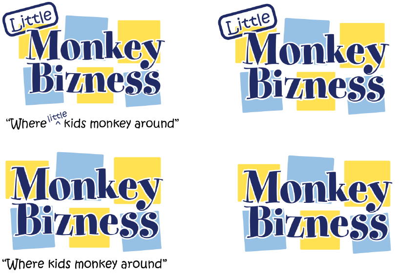
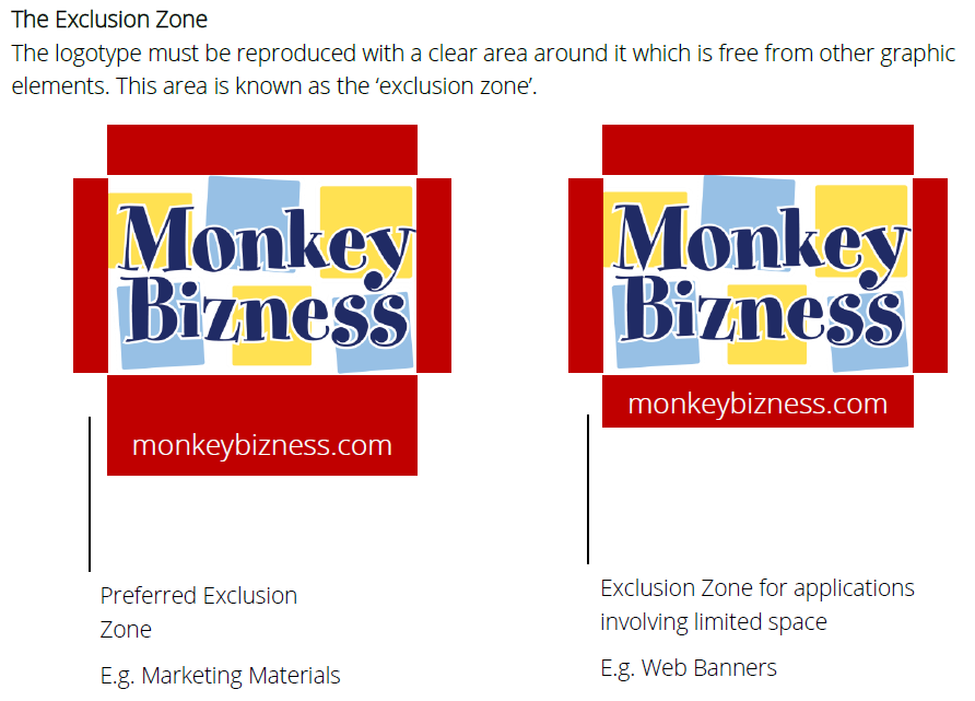
Branding and Style Guide

The objective of this page is to help people who use the brand to understand its origin, the brand values and the best ways of getting the most out of it.

This guide is written for the benefit of those people within the Monkey Bizness and franchisees of the brand. One of the strengths of our brand is our unity and as such, these guidelines should be strictly adhered to.

A brand is always evolving and people’s perceptions of it do change from time to time. As such we will constantly evaluate this guide for updates and will treat it as a living page.

Color Palette

The Monkey Bizness blues are one of our greatest distinguishing features. It is an essential part of our branding and goals moving forward.

Combined with our secondary colors, we have designed a color palette that we believe will work in any combination. Depending on the application, you are free to use the palette below to accomplish your goal.

Colors

Typefaces

The brand fonts

Whimsical, clean, bold…when determining fonts to use for the brand Monkey Bizness had three simple criteria.

Luckiest Guy is bold, confident, whimsical, and clean. It is distinct it its’ appearance and easily recognizable. No shadings or keylines should appear around the business name.

For common and paragraph typeface you can choose between Lato Light and Open Sans. These fonts are light and clean yet resolute and will portray your messages.

You can download all of these font using this link.

Note: All fonts utilized are Google Fonts and therefore are free for commercial use.  For a tutorial on how to download Google Fonts for use on a computer, please follow instructions located at this url: http://www.labnol.org/software/google-fonts-on-computer/19780/

Typefaces

Lingo

Tone of Voice

Don’t over complicate it.  Tell it like it is.

Be direct and get to the point.

Always look for the simplest way to say what you want.

We believe that a message is better read when it’s simple to understand.  Be direct and talk the language of your customer.  They will appreciate your honest and simplicity.

Do not be afraid to use colloquialisms – or should we say…Do not be afraid to use plain and simple phrases.

Pictures and Graphics

Tone of Voice

The pictures we use are expressive, show real emotions and are cropped for maximum effect.

We have facilities which provide our guests with fun.  The look of joy our guests experience and the awesomeness of our facilities should come through in the pictures we use.

Pictures

Logo

Who we are

Our logo is our visual identity…our customers, fans and vendors recognize us by the logo we use.  We want to portray a whimsical, clean and fresh appearance.  Because our logo is who we are recognized as, we must present it in a uniform and consistent manor.

Our logo package can be downloaded here.

Minimum Size

The logo should always be clearly legible.